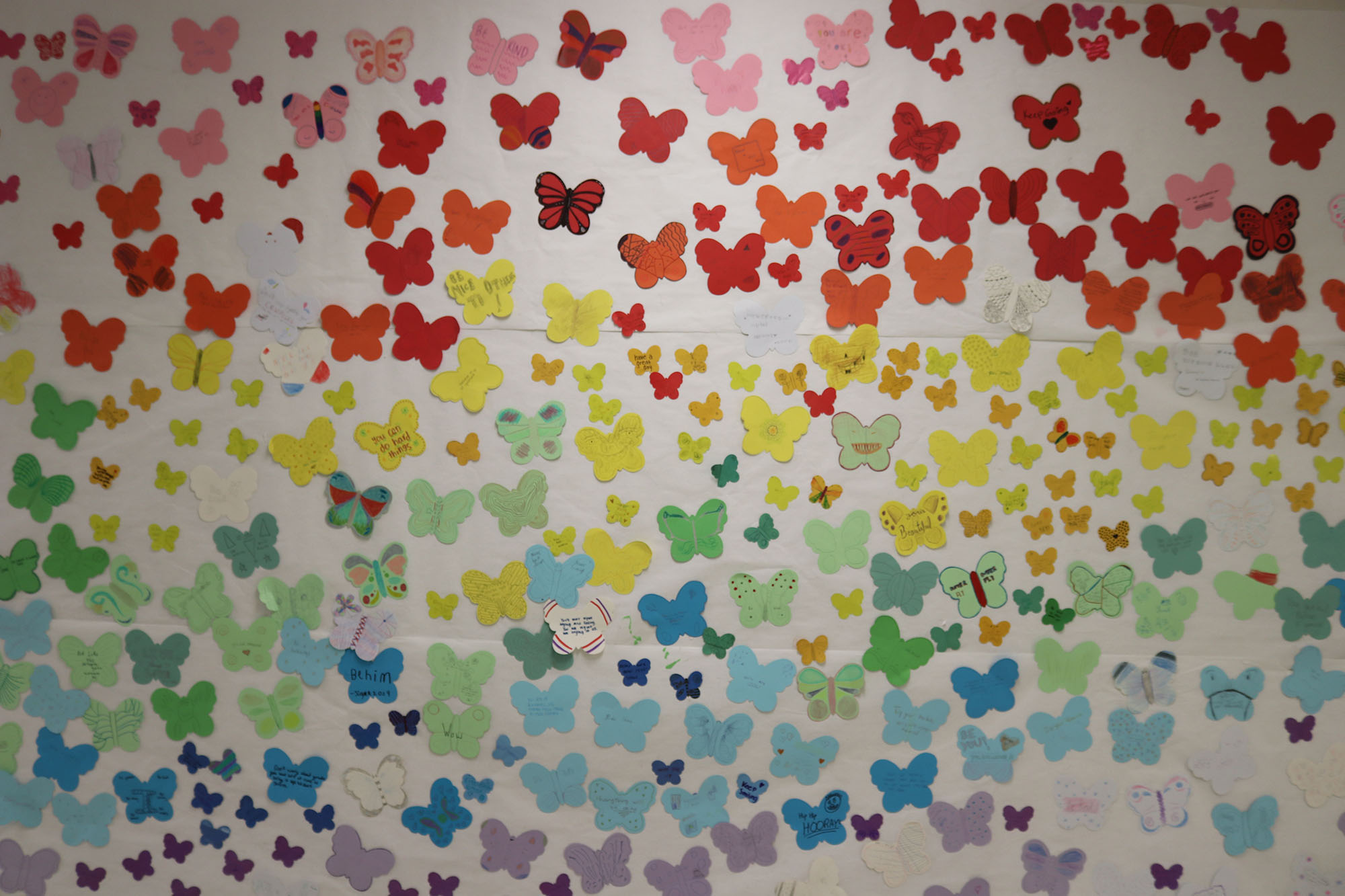
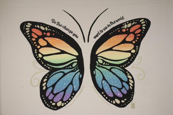
Coloring MHS
Stella Goltzman, senior, thinks of color as a tool to express her personality through contrasting color schemes that express emotions and thoughts in a way that words and metaphors just can’t.
“Color is so important to me. I see different colors and it, like, defines different times in my life,” Goltzman said.
Goltzman is an artistic entrepreneur and AP art student. She said the way people utilize color helps define who they are.
Goltzman said hot pink represents her childhood — a time of unapologetic confidence and being fearless. Vibrant, garish colors like teal or purple represent her tween years — a time of uniqueness and individuality.
Neptune Hardcastle, sophomore, sees color as a way to gain insight into someone’s personality, the first little peek into someone’s true colors.
“Immediately when we see someone and we see, like, the color clothes we’re wearing, we immediately get a vibe from them on how they act and who they are,” Hardcastle said.
Hardcastle said they personally have a chill, down-low personality and they use darker and cooler tones in their outfits to portray that.
Kelsey Starr, 3D Art, Drawing and Art Fundamentals teacher, sees color as a way to connect with the world around her, focusing on varying symbols for culture and history and people.
For instance, Starr finds that pine green is a connection to nature. It’s like a breath of fresh air.
“I wouldn’t want to live in a world without color,” Starr said.
Ashley Hobbs, psychology teacher, said color is a major part of the study of psychology that symbolizes emotions such as how yellow tends to be happy. Red can mean either love or anger.
“I associate purple with my mom since that was her favorite color. Especially since my mom’s passed I look at the sky and say, “Is my mom trying to talk to me?” Hobbs said.
Color affects how people think of one another as well, which she said leads to two types of bias: explicit, which is outward, and implicit, which people may not be conscious of.
“If you’re walking down the street and pass someone wearing all black that’s seems to be a little more threatening than someone who is wearing a white shirt and jeans,” Hobbs said as an example of implicit bias.
In reality, the colors someone wears do not tell whether they will be dangerous at all.
Colors in psychology can also be in trends.
“I painted my walls red because it was trendy and stylish and when the fad went out, I was like I HATE MY WALL!” Hobbs said.
Whatever color is “trendy” will never make you truly happy, Hobbs said.
What color palette do you most identify with?
Sorry, there was an error loading this poll.

Similar to judging a food by its color, people also may judge a book by its color.
“A bright colorful cover can grab your attention if you’re just sort of grazing, you know, like browsing through the shelves,” Ray Holmes, librarian, said.
Colors or color schemes can pop out to certain people. If something is “in fashion” it would be more appealing and eye-catching.
If a book has similar colors as other books one’s read, then they would want to read that one too, Holmes said.
“Because the design flips your expectations for what that book is, I think it might entice certain readers to read it,” Holmes said. “I’m always interested in a book that sort of, you know, maybe does something different than what I expect.”
Elizabeth Bahr, junior, said she’s not too good at judging books by their cover, but instead picks out books that are her favorite color.
“If the cover’s purple I’ll be like ‘let’s see what that book is about’,” Bahr said.
In her younger years, she read mostly graphic novels. She said this is because the colors used in the books were so perfect and the cover was so simple that it made her want more.
“Looking back, I probably wouldn’t have read those books if they didn’t have color,” Bahr said.
Assorted colors can change the overall mood of a book, Brittany Sharitz, librarian said.
“If you go to the horror section you will tend to see darker shades and hues like black or red,” Sharitz said.
In romance there will be very bright or pastel colors like lots of pink and blues. Science fiction has lots of greens, navy blues and blacks or gray. Dystopian novels like to use more “serious colors” like gray, black and brown, Sharitz said.
“Anyone who puts a book out there without intentional colors on the cover is missing out on a valuable opportunity to appeal to their audience,” Sharitz said,
Color can also have a toll on readers’ attention spans. Sharitz said readers are more likely to want to keep reading a book if it has the colors the reader enjoys.
“If you pick up a book and you knew what it was supposed to be about but it had colors that did not reflect the book’s themes or ideas it could be confusing or off putting,” Sharitz said

After buying pink cameras for her sons, Sarah Zenthoefer, Child Development teacher, realized her son had started calling pink a “girl” color. This shocked Zenthoefer, as she had never taught or mentioned this to her children.
“My husband and I do not feel that there are ‘boy colors’ and ‘girl colors’, but clearly my children heard that from somewhere,” Zenthoefer said.
Zenthoefer said children as young as 4 years old learn about “boy” and “girl” colors from their peers and are influenced by their environment. They then pass on this knowledge on to others.
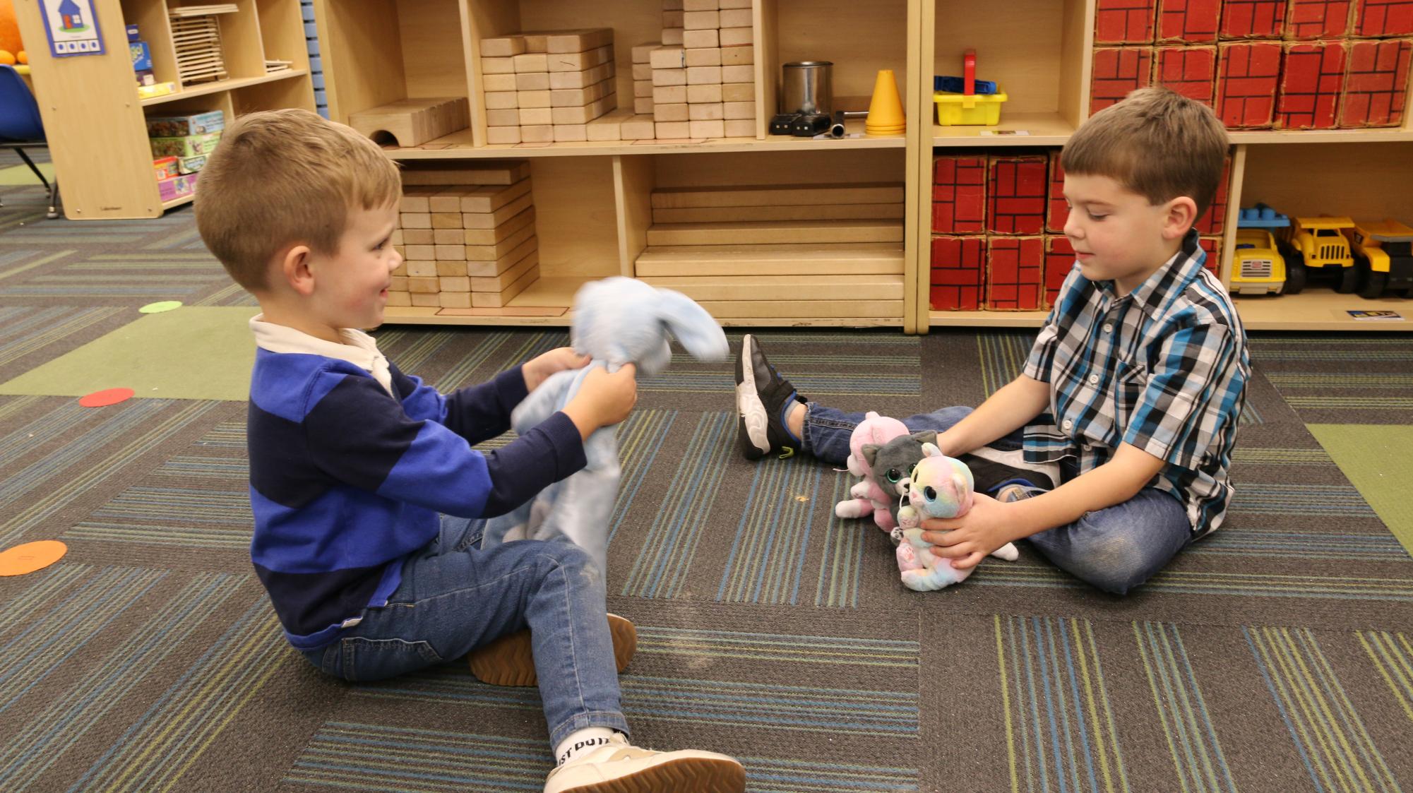
Recognizing colors is a big part of the curriculum for preschoolers. Some students go into preschool not being able to tell the difference between colors or knowing the names of colors. This is why these children do activities, such as finger painting, to identify and understand the colors around them, Zenthoefer said.
When children are first born, they are predominantly drawn to primary and abstract colors, Zenthoefer said. This is why the preschool classrooms tend to have brighter colors surrounding the room compared to the high school classrooms.
McKenzie Barney, preschool student, is an example of how gender norms influence children. Barney said a classmate taught her what “boy” and “girl” colors are.
Barney said her favorite colors are pink and blue because she associates them with her Barbies. Barney used to like the colors yellow and green, but she has grown out of them and doesn’t like them anymore.
Maggie Caskey, junior, said her favorite color has been modified since her childhood to reflect her maturity.
“I used to love hot pink, and now I’m definitely into more toned down colors. Like, the majority of my wardrobe is all neutral colors,” Caskey said.
From the perspective of a high school student such as Caskey, a preschool classroom can be overstimulating compared to what they normally see in their classes. Caskey takes Child Development and said there is a difference in the way color is incorporated into the preschool and high school classrooms.
“You can definitely tell when you go to the preschool there are so many more brighter colors — and kind of every color of the rainbow — versus in some of the classes in high school where it’s more dull,” Caskey said.
While observing preschoolers, Caskey noticed the preschoolers’ behavior as they created a pumpkin patch craft. This was a project where the preschoolers took their play area and made it into a pretend pumpkin patch.
They added to the pumpkin patch by making popcorn, paintings and posters. Caskey said the preschoolers started associating some of these objects with certain colors.
“If they see something yellow, they think they can make it into a popcorn or something like that. They associate it with real life things,” Caskey said.
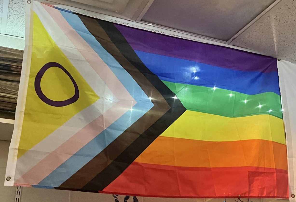
Rainbows symbolize many things including hope, love, happiness and acceptance. But one of the more well-known meanings behind the rainbow is more recent: the pride flag.
The rainbow pride flag debuted in 1978 designed by Gilbert Baker, a queer artist. The original flag had eight colors, including hot pink and turquoise, but the more recent flag features six colors: red, orange, yellow, green, blue and violet.
The rainbow is now a symbol of queer culture, including being used for PRISMA, the school club that speaks out against discrimination and educates people on LGBTQ+ history. PRISMA members meet after school every Wednesday in Room G20.
“We recently did change our name, and we chose PRISMA,” senior Apollo Hardcastle, PRISMA club president, said. “It invokes the thought of color. And that’s really important because color can also be a very heavy symbol of diversity, and inclusion.”
Other than the most notable rainbow flag, there are other pride flags that represent the queer community. Some of the more recognizable are the pink, blue and purple bisexual flag, as well as the pink, white and blue transgender flag.
“Colors can have a lot of different meanings to people,” Hardcastle said. “When you assign those meanings to the colors it can create a sense of unity for people.”
Wearing the color combinations of different pride flags can show support for the LGBTQ+ community.
“You want people to know that you are there to help them, but also you don’t wanna put yourself in a position where somebody could attack you for your character,” Emily Thompson, PRISMA club sponsor, said. “Just having your colors to show your support, or to tell people who you are in a more subtle way, it’s to keep yourself and others safe.”
The colors on pride flags represent the LGBTQ+ community as a whole, but the community also shows color on an individual scale.
“When you’re outwards with your sexuality or you’re outwards with your identity, people see you as more colorful,” sophomore Charlie Coder-Arce, PRISMA club member, said “Everyone is seen as an important individual. No matter who they are, or what they’re born as.”
Many PRISMA flyers are shown around school, with hints to the rainbow pride flag in the design.
“PRISMA is very connected to standing out, as gay people have had to do through history,” Coder-Ace said. “We’ve had to stand out, so then we’re heard of. The very vibrant colors that usually catch your eye, make it more well known around the school.”

Trouble differentiating the colors at a traffic stop light or picking out ripe fruit at the grocery store — these challenges are a daily reality for people who have color blindness, a condition that impairs their ability to perceive common colors.
In a world that uses a vibrant color system, about 300 million people are diagnosed with color blindness, according to the National Eye Institute (NEI).
According to the NEI, color blindness, or color vision deficiency (CVD), is a visual condition that affects color perception, often inherited through the X chromosome, making it more common in men. It occurs when one or more of the eye’s three color-detecting cone cells — red, green or blue — are impaired.
The most common type of color blindness, red-green color blindness, is when the red or green cones in the eye don’t function properly, making it hard to distinguish between these colors. In rare cases, total color blindness (achromatopsia) occurs, when all cones are nonfunctional, reducing vision to shades of gray and brown, according to the NEI.
Dr. Cathy Farrar, science teacher, was born with red-green color blindness.
“Whatever you see and I see are two different things, but now you are associating that color with what you are told you see. All of color sensing is an association,” Dr. Farrar said.
Parents are teaching their toddlers to identify colors, creating associations in the child’s brain. For people with color blindness, color associations differ because they perceive certain colors differently or may not distinguish between them at all, Dr. Farrar said.
“Kids are taught to associate specific names with colors, but their perception means their internal experience of colors doesn’t fully align with what others see,” Dr. Farrar said.
Nicolas De Castro, freshman, was diagnosed with red-green color blindness..
“When I am deciding on an outfit, I don’t really know what matches because some colors look the same depending on the lighting,” De Castro said.
For De Castro, colors like green and brown or red and orange can appear similar, or a “blended” like look, making clothing coordination challenging and sometimes leading to mismatches.
On the other end of the spectrum, Jason Crogan, sophomore, was diagnosed with partial red-green color blindness.
“Yeah, it can be annoying, especially in certain games, where it says ‘that’s the green team, or that’s the yellow team’ and I don’t know the difference,” Crogan said.
Advancements in technology have attempted to relieve some of these difficulties. EnChroma, one of the leading color blind glasses, uses color perception neuroscience, optical dyes, and lens material innovations. However, these glasses cost around $150-300 each, making them less available for many who could benefit from them.
Ultimately, color blindness is a condition that affects people’s experiences in both obvious and subtle ways. Recognizing and accommodating these differences can help create a more inclusive world for those with color vision deficiencies.
Your donation will support the student journalists of Marquette High School. Your contribution will allow us to purchase equipment and cover our annual website hosting costs. You may become a PATRON by making a donation at one of these levels: White/$30, Green/$50, Blue/$100. Patron names will be published in the print newsmagazine, on the website and once per quarter on our social media accounts.
